Production Dashboards & Reports
Puush provides company-wide views to monitor production across all your projects. These are accessible from the company menu to users with Manager permission.
Production Dashboard
The production dashboard gives you an at-a-glance view of production activity and goal progress across your company.
Filters
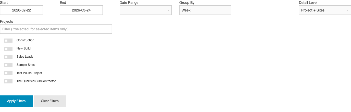
All charts and tables on the dashboard respond to the following filters:
| Filter | Options |
|---|---|
| Date Range | Predefined ranges (This Week, This Month, etc.) or custom start/end dates |
| Group By | Day, Week, or Month |
| Detail Level | Project + Sites (break down by project and site), Project Only (aggregate per project, no site breakdown), or Grouped (combine all projects into a single view) |
| Projects | Multi-select to filter to specific projects |
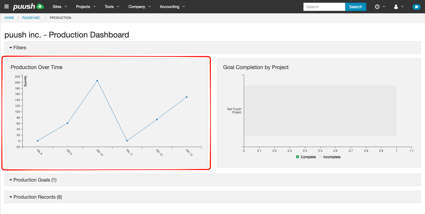
Production Over Time Chart
A line chart showing production quantities aggregated by the selected time period. Use this to spot trends, seasonal patterns, or drops in productivity.
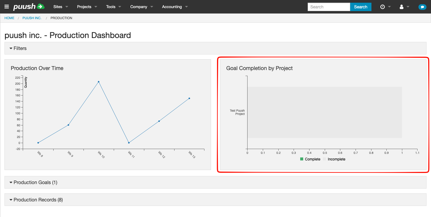
Goal Completion by Project Chart
A bar chart showing the percentage of goals completed for each project. Helps you quickly identify which projects are on track and which are falling behind.
Production Goals Table
A table listing all production goals across your company, showing:
- Project and site name
- Goal name and code
- Target quantity vs. actual quantity
- Progress bar
- Status indicator (Complete / On Track / Behind / Not Started)
This is the same goal data shown at the project level, but aggregated across all projects for a company-wide view.
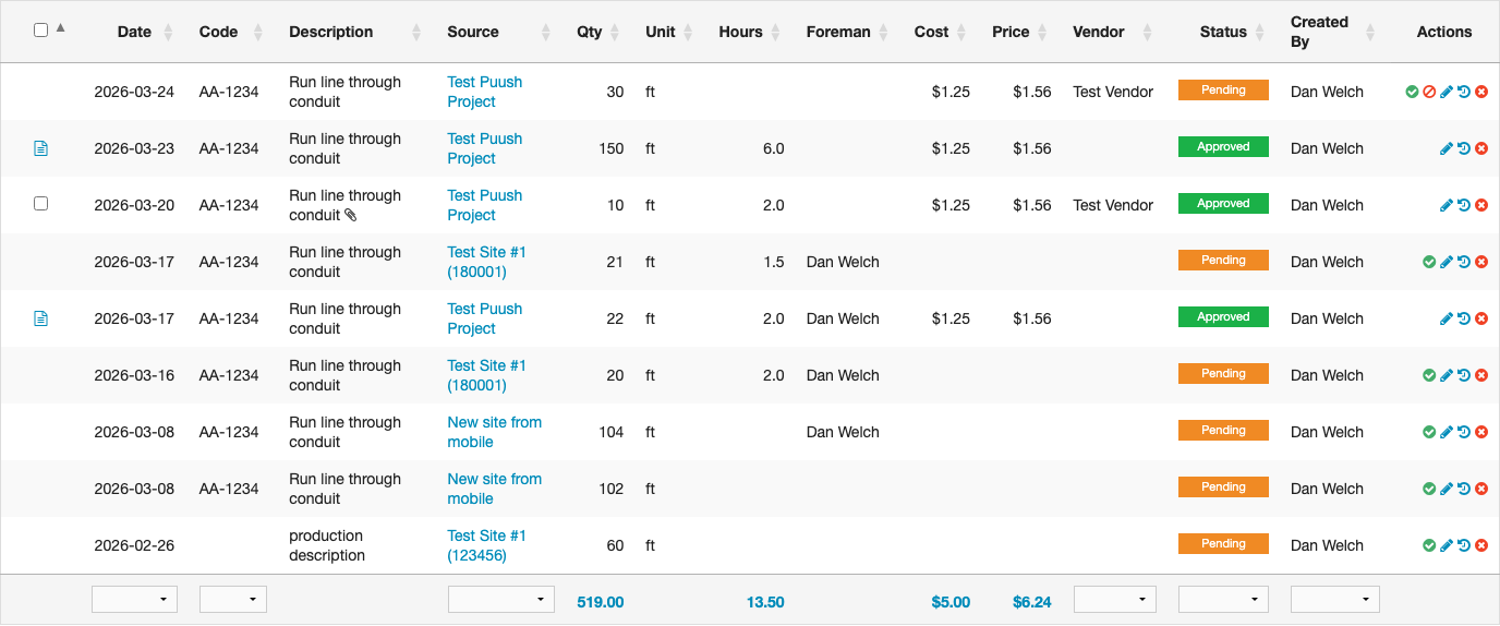
Production Records Table
A detailed table of all production records matching your filters. Includes all standard columns (date, code, description, quantity, hours, cost, price, vendor, status, etc.) plus a Source column linking to the originating project site (or project name if no site is set).
From this table you can also:
- Convert records to pricing sheets (with Accounting permission)
- View approval status for vendor submissions
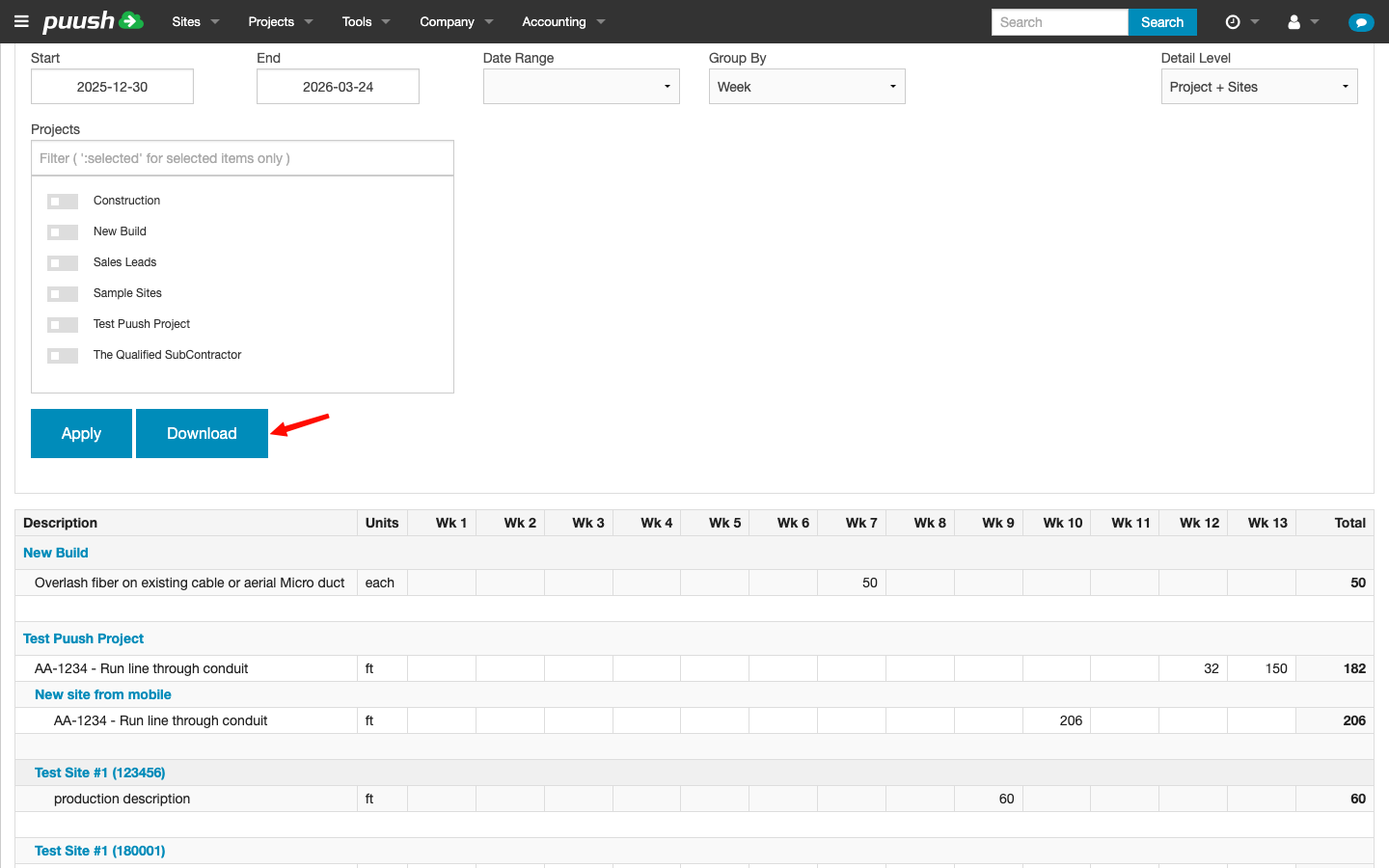
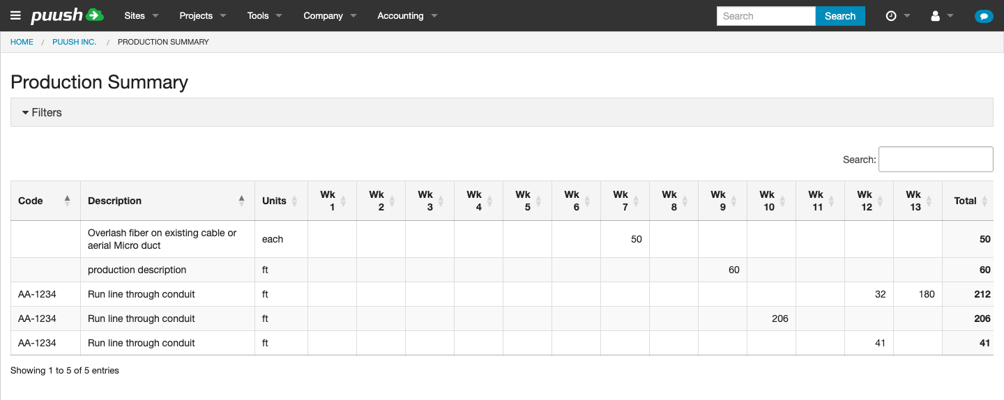
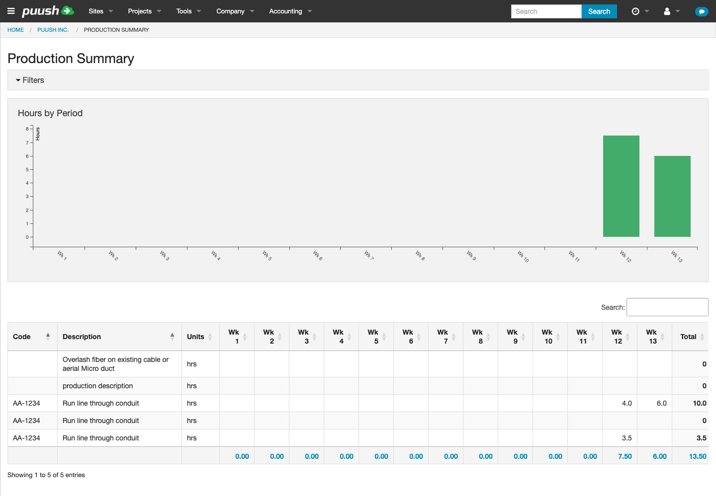
Production Summary
The production summary provides a tabular and visual overview of production data, organized by time period.
Unit Mode
A Unit dropdown in the filter panel lets you switch between:
- Qty (default) — Shows quantity values in the pivot table.
- Hrs — Shows hours values in the pivot table. When Hours mode is selected, a bar chart appears above the table visualizing hours by time period.
How It Works
- Code and Description are shown as separate columns
- Columns show time periods (day, week, or month, based on your Group By filter)
- Values show the total quantity (or hours, depending on Unit mode) for each item in each period
- A Total column on the right sums across all periods
- The table supports column sorting
The table is organized hierarchically:
- Project headers group records by project
- Under each project, individual production items are listed
- If Detail Level includes sites, site headers further break down the data
Qty
Hrs
Downloading as Excel
Click the Download button to export the pivot table as an Excel spreadsheet. The export includes:
- All rows and columns from the pivot table
- Formatted headers and auto-filters
- Color-coded columns for easy reading
This is useful for sharing production reports with stakeholders who don't have Puush access.